IBM Support, Support Search with Watson
Case Study
Date: 2019 - 2020
Role: Lead UX Designer
Team: Scrum Master, Product Owner, Senior Support Content and Chatbot Developer, Support Social Business and Knowledge Manager, Knowledge and Software Engineers, Visual Designer, Development Manager, Developer
Skills: User Experience Design, User Experience Architecture, Functionality Design, and Information Architecture
Tools/Platform: Jira, Sketch, Invision, Salesforce
Project Process: Agile Scrum Hybrid
Website: www.ibm.com (Actual website is not available to the public)
Product Overview
Support Search with Watson is a unified search solution using IBM Watson Discovery AI, for the IBM Cognitive Support Platform. What it does is search through documents from product documentation, technotes, redacted historic tickets, dW Answers (IBM developerWorks social media channel), Redbooks & White Papers, IBM Media Center, IBM Skills Gateway, and stack overflow.
It is used publicly by IBM Clients for self-help and internally by IBM Support Agents and Engineers.
This case study is about the redesign of the internal Support Agent Console.
Project Description
Redesigning and expanding the interface and functionality of the first rollout of Support Search with Watson.
Project Background
The existing search platform was launched in 2017-2018. It was planned and created mostly by Engineers and Developers without any Design and UX. Since its launch, and regular use, the product team was able to amass much more information on how this tool would be used and to clarify the exact needs and goals of the Support Agents and Engineers who used this tool daily.
Challenges
We designed, developed, and user tested each component area in phases, but as we designed new components we realized there were impacts to the previous components. However since they were already developed, there was reluctance to go back and make these necessary changes until MVP 2 or 3 which then often would get pushed back in priority.
In the beginning of the project we were told that we did not have to adhere to the Salesforce Lightning Design System where needed, but then during design we were slowly told that was not the case.
Approach and Solution
Understanding the Problem (What are we trying to design and why)
The main issue and reason for the redesign was that the current search was returning too many search results and that the current filter categories applied to almost all of the documentation.
This led to frustration and more time spent going to outside tools to find the information they needed and manual ways of organizing it to then supply it to customers and hopefully reaccess it again easily in the future when necessary.
In addition there was a large amount of duplicated documentation and no ability to view and link documentation for similar cases.
Short and Long-term goals
The short term goals for the project were to redesign the overall all framework, search bar, search results, filters, and preview.
The longer terms goals were to then incorporate custom filters, saved views, similar documents, my cases. This would also incorporate updates/enhancements that were not able to be included in the short-term rollout.
Users
• Support Agents
• Support Engineers
Existing site or application
The existing search platform had three separate UIs that were to be part of the redesign.
Web stand-alone version
This is outside of their Salesforce internal support console but still using the Salesforce Lightning Design System.
This can be accessed by any IBMer, not just Support Agents and Engineers.
Inside support console
This was inside the Salesforce internal support console and full screen.
Note: Screenshot same as embedded version except full screen.
Inside support console embedded in an open case
This was inside the Salesforce internal support console but embedded inside an open case view.

WEB STAND-ALONE VERSION

EMBEDDED CONSOLE VERSION
Design and technical limitations/restrictions
Two of the Support Search with Watson UIs were located within the Salesforce support platform so we were partially limited to Salesforce Lightning Design System components which did not cover all the layouts and functionality we needed.
In addition the embedded Support Search UI was in a very condensed area with limited real estate to work with.
This project was focused only on the search screens, not the steps users took to get to these screens which in the embedded UI was not easy to find.
Existing metrics and user feedback
User feedback was obtained through three recorded sessions that were previously conducted by the Product Owner. The outcome of these sessions was then compiled by the Product Owner in a mural board including initial ideas for layout and functionality that were iterated on by the Product Owner and myself.

METRICS ON QUERY LENGTH

USER OPTIONS AND PREFERENCES

USER FEEDBACK - RESULTS LINE

USER FEEDBACK - PREVIEW

USER FEEDBACK - FILTERS

USER FEEDBACK - OVERALL LAYOUT
Discovery and requirements that had already been done
There were initial requirements gathering meetings with the team before I came on to the project. Based on these meetings and the user feedback sessions, the Product Owner created some initial draft proposal layouts to use as a reference.

PROPOSAL FOR OVERALL LAYOUT 1

PROPOSAL FOR OVERALL LAYOUT 2

PROPOSAL FOR RESUTLS LINE
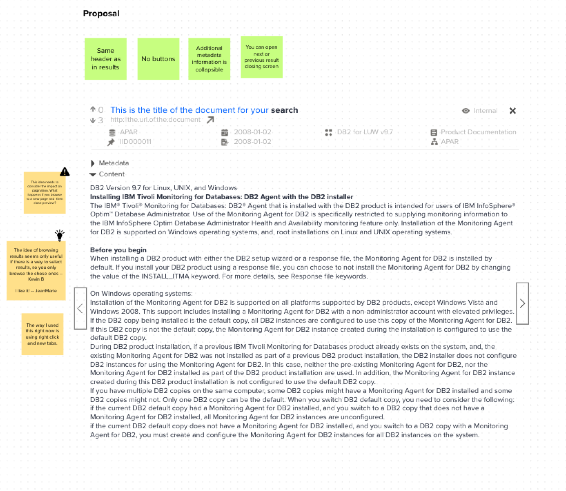
PROPOSAL FOR PREVIEW 1

PROPOSAL FOR PREVIEW 2

PROPOSAL FOR FILTERS 1

PROPOSAL FOR FILTERS 2

PROPOSAL FOR FILTERS 3

PROPOSAL FOR FILTERS 4

PROPOSAL FOR FILTERS 5

PROPOSAL FOR FILTERS 6
Requirements gathering and flushing out existing requirements
My process at this point was to analyze the existing search interface and functionality to make sure I understood what every element is, how it functions, and how it’s used.
While I was doing that I created my own UX Audit of the product based on general UX best practices.
I then reviewed the current requirements, user feedback, and proposed layouts to come up with a list of questions, comments, and ideas to discuss with the Product Owner.
Since we were approaching this in phases I first focused my questions on the search results line component.
Here are some of my initial questions and some general ones:
General
1. Are these pages responsive? (embedded and stand-alone)
2. Are we designing for different screen sizes?
Result Line
1. In the heading bar for results, what is “Top Results”? How is that defined?
2. Metadata
a. Please explain each type of metadata, how it’s used, and what the icons mean?
b. What is the priority order of the metadata in importance to the users?
3. How will the voting work?
4. What are the categories for documents and where do they display?
5. Product Names
a. What is the maximum length of product names?
b. If a product name needs to be truncated, does the beginning of the name give the user enough information to understand what it is?
c. Is truncating the product name in the results currently problematic for users now?
6. What is the difference to the user if the document is internal or not? Can the “eye” icon used for internal be changed as this is normally a preview icon.
7. How do “Archived” documents work?
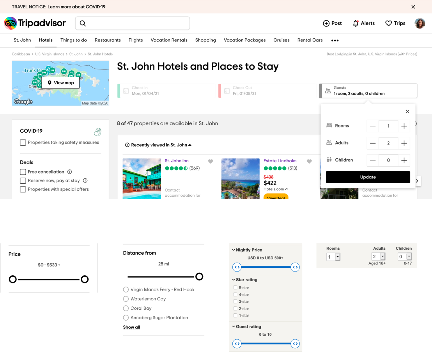
Competitive and Design Research
Since there were a lot of new features and changes we were making to the search I did a bunch of research on search best UX practices, search layouts, search and advanced search functionality, and filtering.
Here are some useful articles I read and screenshots of sites I researched:
UX Research Study on Horizontal Filters
https://baymard.com/blog/horizontal-filtering-sorting-design
How To Improve Advanced Search UX?
https://uxplanet.org/how-to-improve-advanced-search-ux-450df698004c
Better Search UX Through Microcopy
https://www.smashingmagazine.com/2019/06/better-search-ux-microcopy/
The Dreaded Boolean Search
https://medium.com/next-century-user-experience/the-dreaded-boolean-search-413fa757a81c
Toggle Switch Guidelines


Design
After flushing out the requirements, I was ready to start wireframing. The order the search component areas would be worked on were:
• Results Line
• Overall Layout
• Preview
• Filters
• Saving Views
Results Line
The issues with the current Results Line were the following:
• Vertical scanability time needed to be reduced
• “Top Results” page heading not useful
• Excerpt was too long at times and content unclear
• Bolded search term matches blended into the page design
• The url was not clickable
• Confusing preview icon used for internal documents
• The category “Product Documentation” wasn’t useful
• Not enough information about ARM (Asset Reuse Manger) categories and voting
• Some important pieces of metadata missing
Over many iterations with the team and user feedback sessions we decided on the following:
• We would have two views of the search results, a simplified view and an expanded view
• The user could show/hide the excerpt for both versions
• The simple view would have a tooltip displaying the full information from the expanded view
• The excerpt area of the result would be changed to the beginning lines of the document
• Eight types of metadata attributes would be displayed in a new priority order in fixed vertical columns for easier scanability
• ARM votes would stay in the metadata area as to not over prioritize their importance.
• ARM Categories would not be able to be displayed for technical reasons
• All metadata will have tooltips that display both the name in natural language and
• Metadata attribute name format to help users who use advanced query syntax search format
• New categories of accessibility for documents were added with new icons and tooltips
Here are my Results Line wireframes displaying the different versions:

RESULTS LINE (STAND-ALONE) - EXPANDED EXCERPT

RESULTS LINE (STAND-ALONE) - EXPANDED NO EXCERPT

RESULTS LINE (STAND-ALONE) - SIMPLE NO EXCERPT

RESULTS LINE (STAND-ALONE) - SIMPLE EXCERPT
Overall Layout
The issues with the current overall layout were the following:
• No ability to collapse or close filters column once opened
• Documents per page taking up space in header and not a priority
• Number of results and time to get results taking up valuable vertical real estate and not a priority
• Need a more condensed top third of the page
• Advanced Query Syntax feature information hard to find
Over many iterations with the team and user feedback sessions we decided on the following:
• Move the filters button from the header to the left column and make filters collapsible
• Reduce the width of the search bar after researching metrics on average search query length
• Move preferences to a more standard location in the upper right of the header
• Add in a help icon
• Add the simple/expanded results line view button to the header area
• Add the show/hide excerpt to the header area
• Separate out sorting ascending/descending from the sort dropdown due to priority
• Move pagination and documents per page to the bottom
• Add the ability to search “My Cases” as a dropdown to the search bar
• Selected filters area expanded in header to show number of search facets selected per filter category with the ability to clear each and all selected from that category
Here are my Overall Layout wireframes:

OVERALL LAYOUT - PAGINATION FILTER CLOSED

OVERALL LAYOUT - PAGINATION FILTER OPEN

OVERALL LAYOUT - MAX WIDTH 1033

OVERALL LAYOUT - SELECTED FILTERS

OVERALL LAYOUT - FILTERS LEFT COLUMN

OVERALL LAYOUT - MY CASES, TOOLTIPS, DROPDOWNS
Preview
The preview is what the main search result title links to. This is a stripped-down version of the actual webpage that allows the user to scan through the documents faster since they don’t need to leave the search area.
Some of the issues with the current preview were:
• Did not include same metadata from results line
• Did not have lists of similar cases
• Metadata button easily missed
• Needed more user friendly layout for metadata
• Needed faster way for users to scan multiple document previews and grouping results
• Knowledge bar for ARM documents didn’t show numbers for Comments and Recommendations
Over many iterations with the team and user feedback sessions we decided on the following:
• Preview heading added to preview screen
• The users wanted a more vertically condensed header area and asked to reduce the metadata from the results line to one row and only show priority items
• For ARM knowledge bar, users liked fewer clicks with grouped icons rather than dropdown
• Text version of the preview, metadata view and similar docs list where changed to tabs to more easily flip back and forth and scalability for more features
• Similar docs links will open a new tab that will display the preview for that document
• Metadata layout changed to tabular view for easier scanability
• Previous and next buttons added
Here are my Preview wireframes:

PREVIEW (STAND-ALONE) - TEXT TAB, FILTERS CLOSED

PREVIEW (EMBEDDED) - TEXT TAB, FILTERS CLOSED

PREVIEW (EMBEDDED) - ARM BUTTONS WITH NUMBERS

PREVIEW (EMBEDDING) - FILTERS OPEN, METADATA TAB
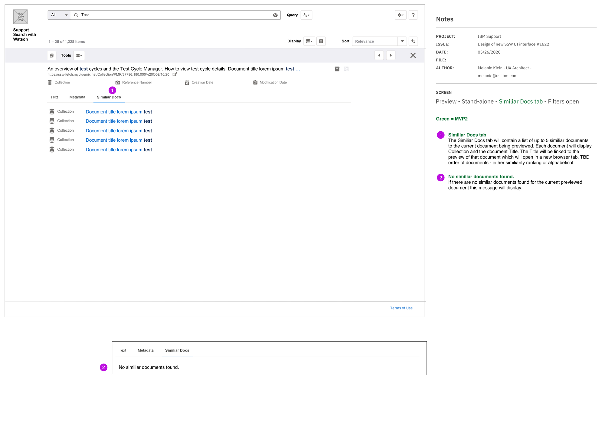
PREVIEW (STAND-ALONE) - SIMILAR DOCS TAB, FILTERS OPEN
Filters
The issues with the current filter functionality were the following:
• Needed ability to add more filters due to the amount of information available in the search results
• Source is higher priority than Doc Type
• Needed sort by Doc Type and ARM votes for results
• Wanted number of search results for filter facets
• Clear all filters button easily missed
• Apply filters button easily missed
• Too many search results
• No ability to sort filter facets
• Needed ability to search for filter within filter category
Over many iterations with the team and user feedback sessions we decided on the following:
• “Source” filter label changed to “Collections” due to the fact the actual source could be multiple databases from different areas
• The most important filter was “Source” or Collections and the other filters were secondary
• Due to the unique and vast number of filters available per Collection, we wanted Collections to function more as a silo that needed to be selected before the user could see the available filters
• We also determined that there were a smaller number of Common filters (i.e. Creation Date) that were not Collection specific that the user could select before selecting a Collection
• The user would be able to add/remove multiple filters per Collection and from the Common filters bucket
• Advanced Query Syntax option was removed from Preferences and added to the header area (this was done in the Filters wireframe set even though this is not a filter)
Here are my Filters wireframes displaying the different versions:

FILTERS - WELCOME

FILTERS - ADVANCED QUERY

FILTERS - WELCOME, FILTERS PANEL DETAIL

FILTERS - FILTERS HELP MODAL

FILTERS - SEARCH - FILTERS CLOSED

FILTERS - ADD FILTERS, COMMON ADDED

FILTERS - SELECTED SOURCES

FILTERS - ADD FILTERS, SELECTED COMMON

FILTERS - SELECTED SOURCES FILTER ADDED

FILTERS - SELECTED SOURCES FILTER FACETS SELECTED

FILTERS - SELECTED SOURCE BEING REMOVED TOAST

FILTERS - SELECTED SOURCE AFTER REMOVED

FILTERS - FILTER TYPES
Saving Views
The only saving functionality that the current search had was saving one set of filters, sorting and preferences. That did not meet the user’s needs and it was unclear that the one save functionality also pertained to preferences.
The new requirements for adding a Saving Views feature were the following:
• Being able to save and manage multiple views
• Views could be private or shared with a team
• Saving the search term would be an option
• Views could include Docs Per Page and display preferences (i.e. simple/expanded view, sorting, etc.)
• View could be set to be the default when search was opened
Over many iterations with the team and user feedback sessions we decided on the following:
• Views dropdown will display in header once a view is saved
• Views will have Save and Save As functionality
• Views will have a management modal where the user can search for views, rename, delete, and set as default
• The user will have the option to select what is saved in the view
• Shared views would be create in a future phase
Here are my Saving Views wireframes:

SAVING VIEW (EMBEDDED) - WELCOME (NO SAVED VIEWS)

SAVING VIEWS (EMBEDDED) - WELCOME (IF USER HAS VIEWS)
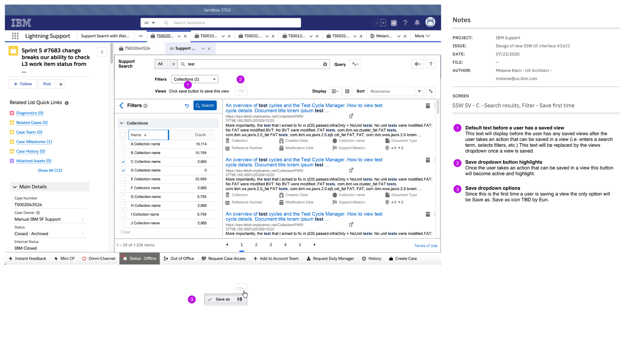
SAVING VIEWS (EMBEDDED) - SEARCH RESULTS, FILTER, SAVE FIRST TIME

SAVING VIEWS (EMBEDDED) - MODAL SAVE AS

SAVING VIEWS (EMBEDDED) - MODAL SAVE AS ERROR

SAVING VIEWS (EMBEDDED) - TOAST AFTER SAVE OR SAVE AS

SAVING VIEWS (EMBEDDED) - SEARCH RESULTS, CHANGES MADE TO VIEW
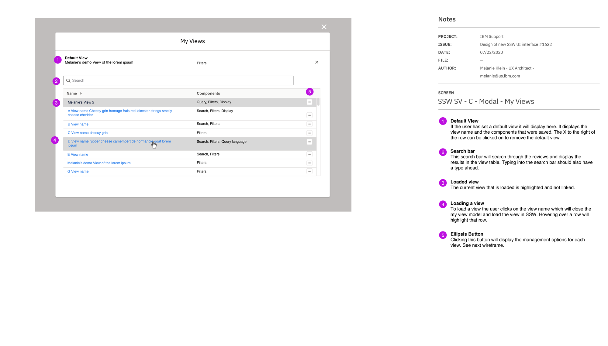
SAVING VIEWS (EMBEDDED) - MODAL MY VIEWS

SAVING VIEWS (EMBEDDED) - MODAL MY VIEWS, RENAME

SAVING VIEWS (EMBEDDED) - MODAL MY VIEWS, DELETE

SAVING VIEWS (EMBEDDED) - MODAL MY VIEWS, SET AS DEFAULT
Summary
The completion of initial full redesign of Support Search with Watson (which was shortened to just Support Search late in the project), took close to a year to complete. In later phases additional functionality was added that further personalized the experience to the Support Agents and Engineers needs such as having the option for their product be the default search term, incorporating additional sections of the Support Console and external tools into the Support Search and adding search History.
Previous Case Study:
Next Case Study: